





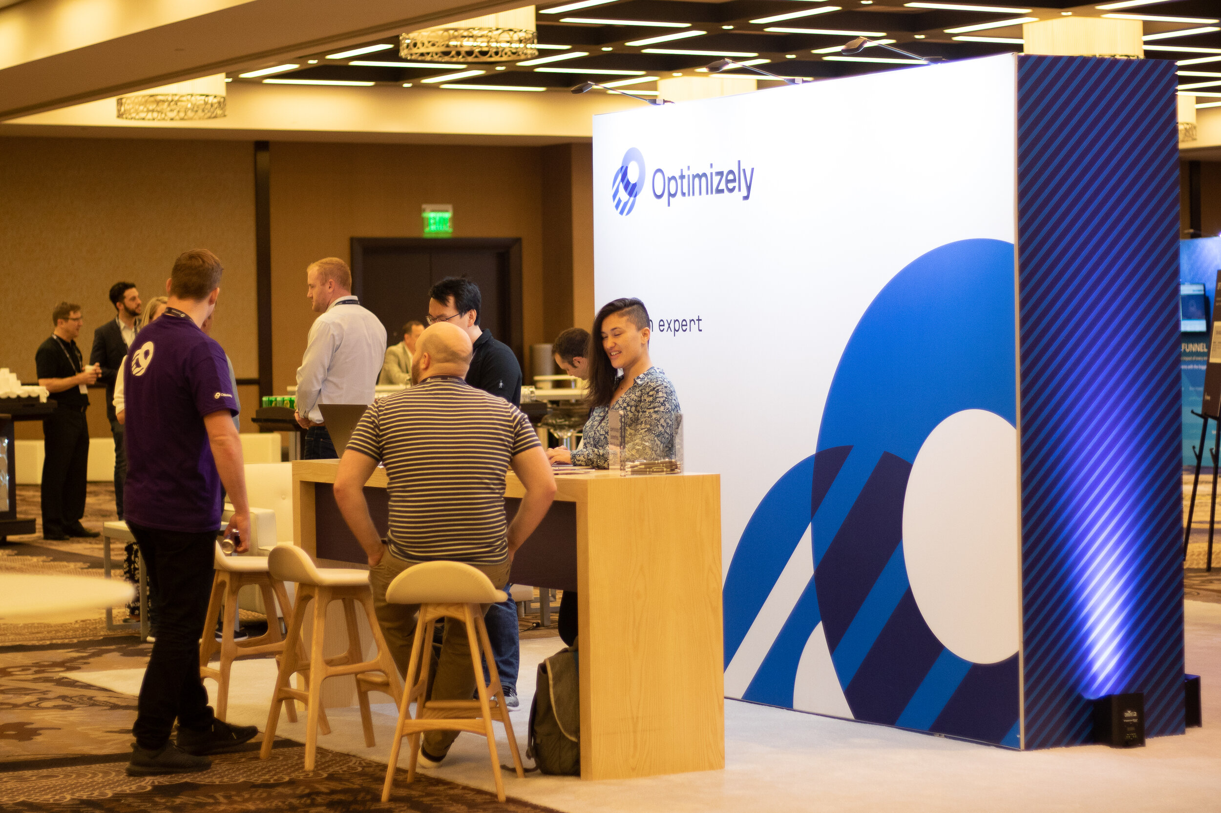

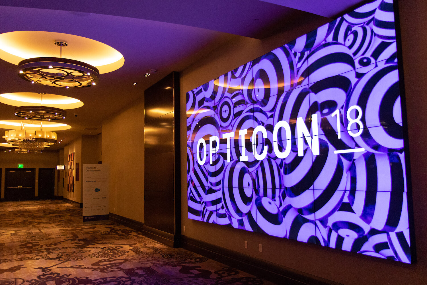
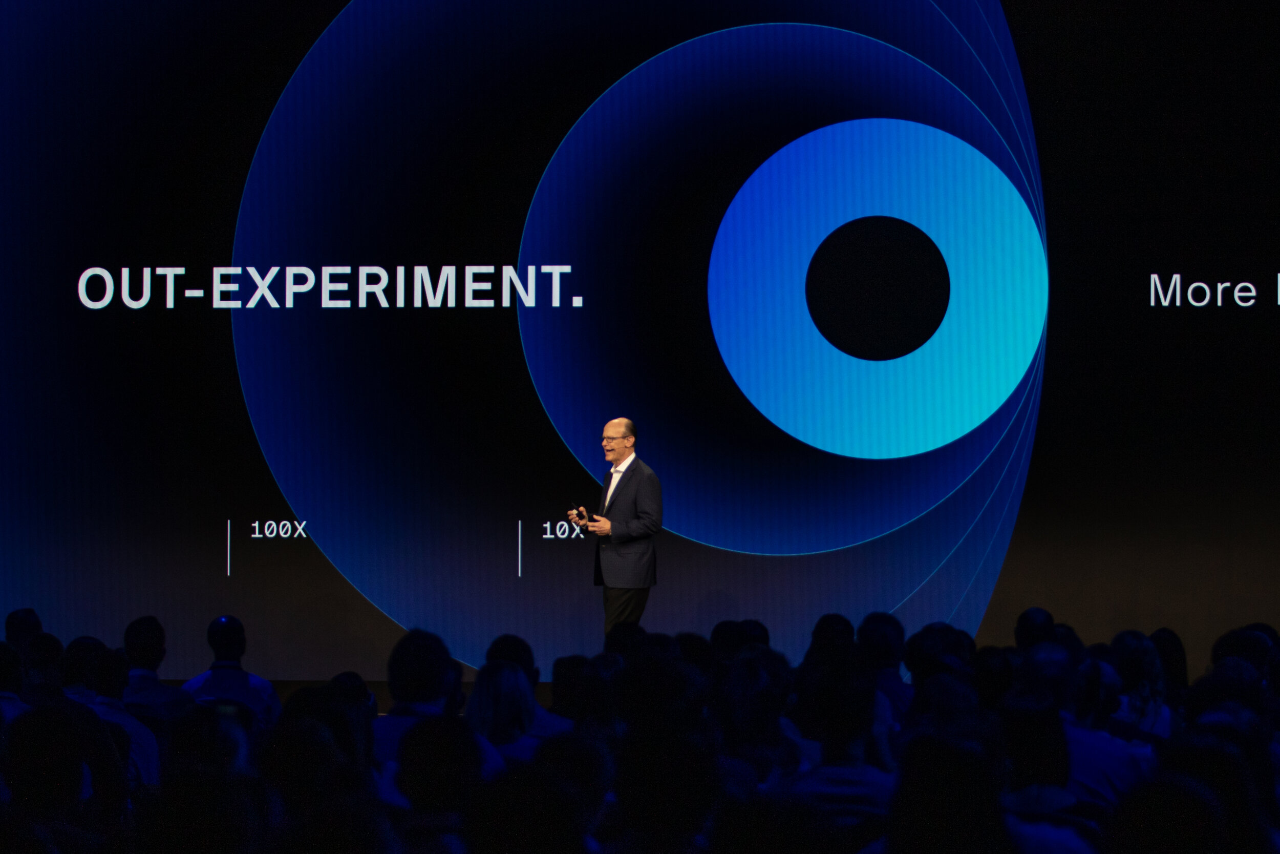
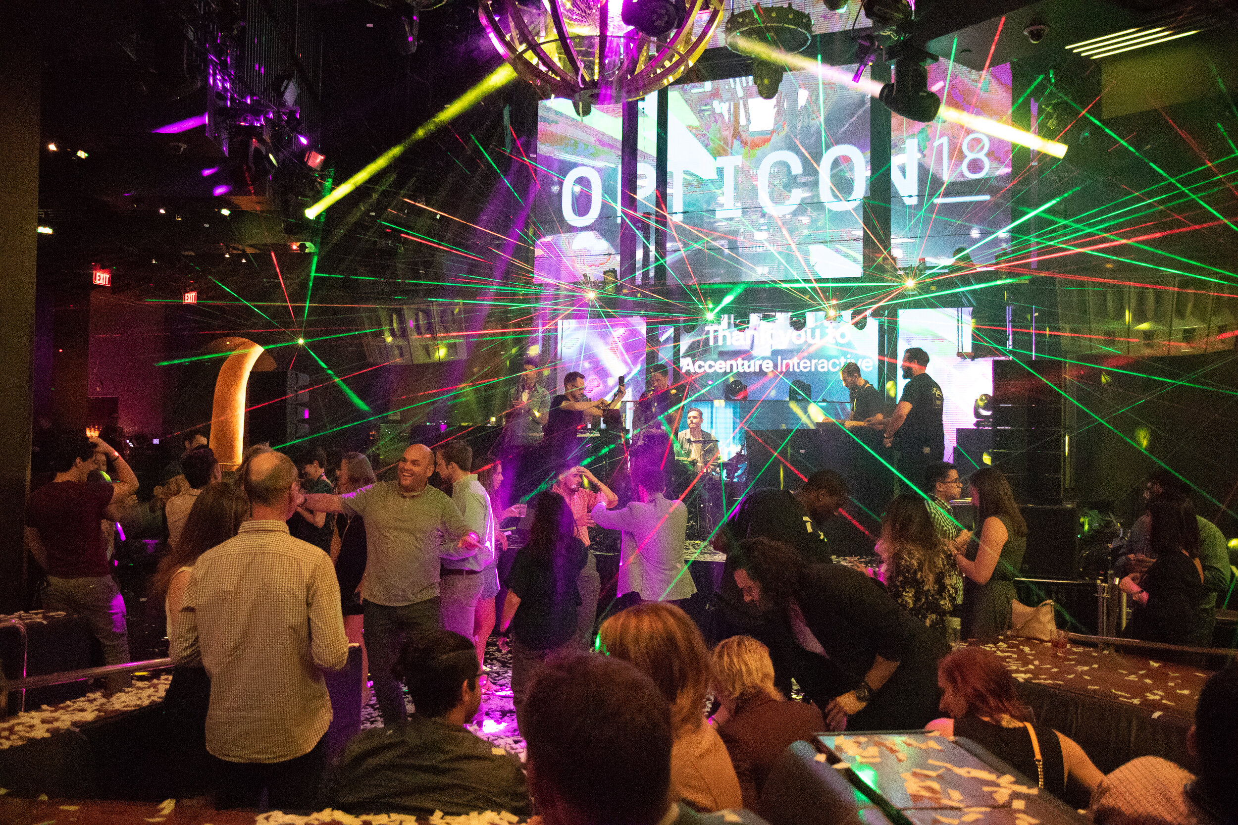
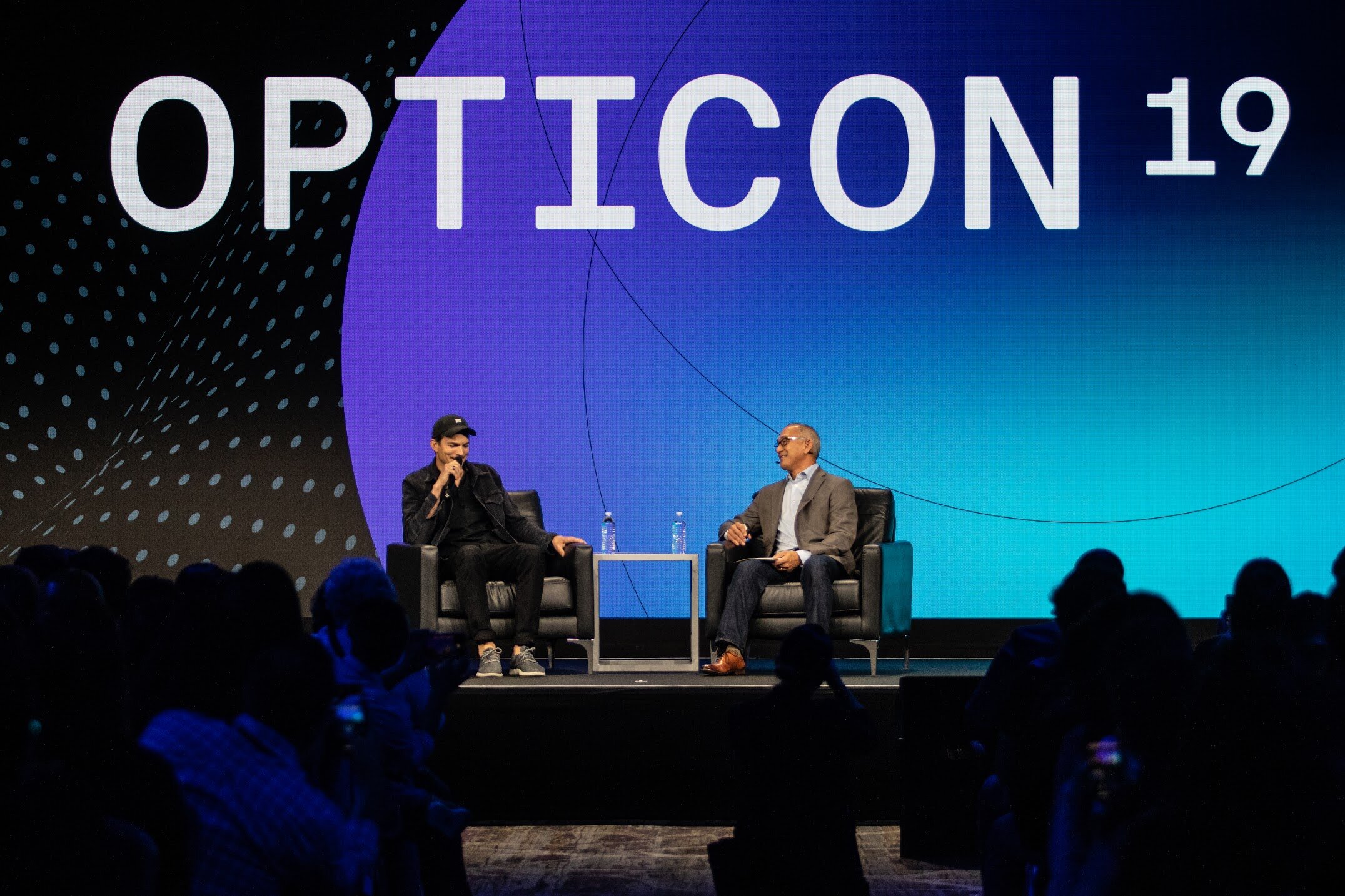
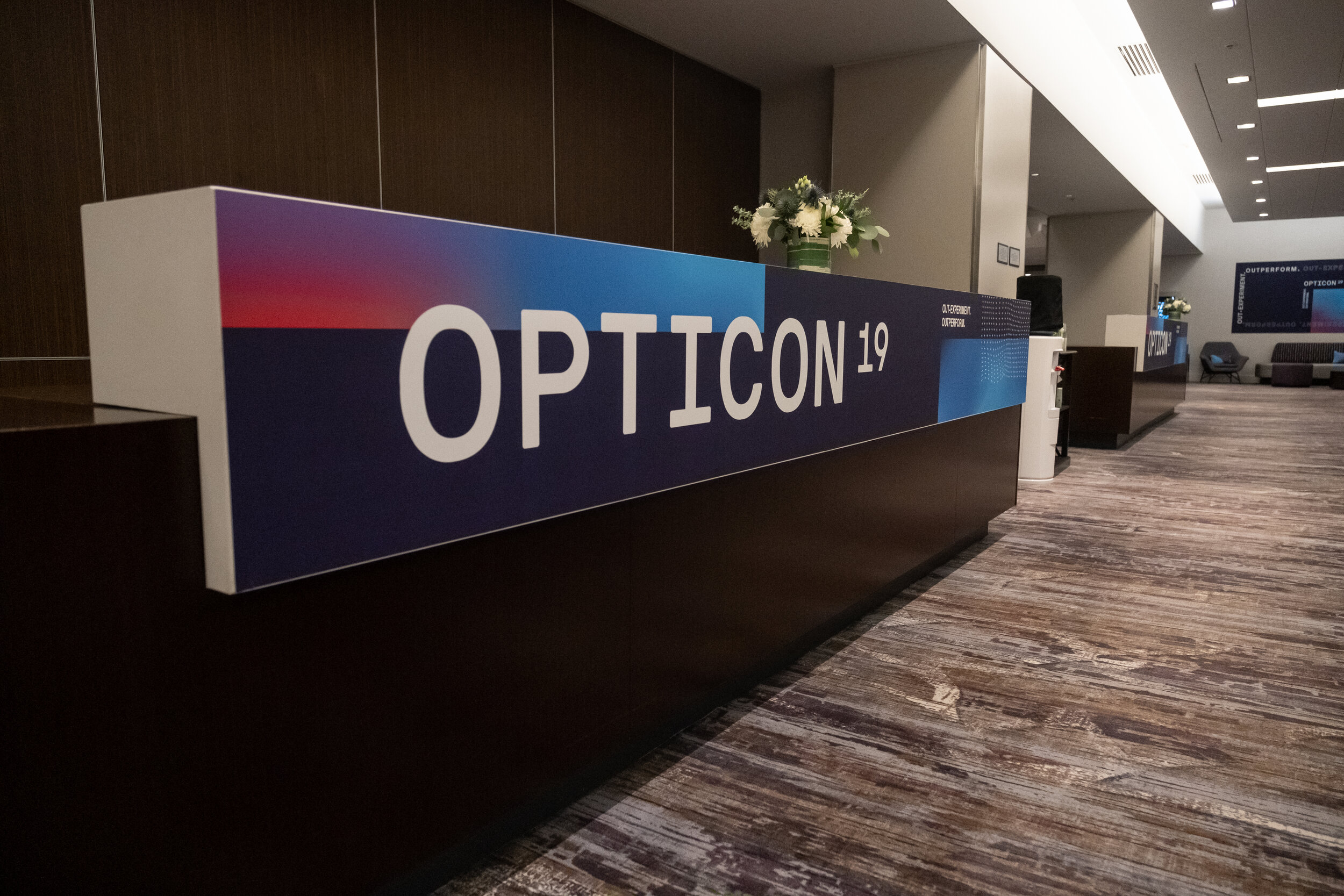

In 2017-18 I directed an external agency and internal team to flesh out a bolder, more modern identity for Optimizely, a company that positions itself on the idea of bolder decisions through experimentation. This is the front of San Francisco HQ. The new logo can be found adorning offices in London, Amsterdam, Cologne, New York and Sydney.

Bold, clean graphics and geometric shapes define the new brand. The many “pieces” you see in the graphic represent experimentation trials or iterations.

A sampling of performance marketing and web graphics. We ultimately rebuilt the entire marketing assets library with newly branded content, so that marketing groups could build and write on their own, with far better efficiency.

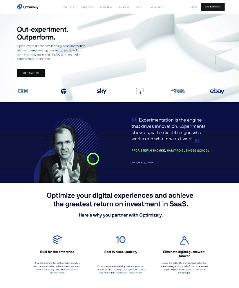
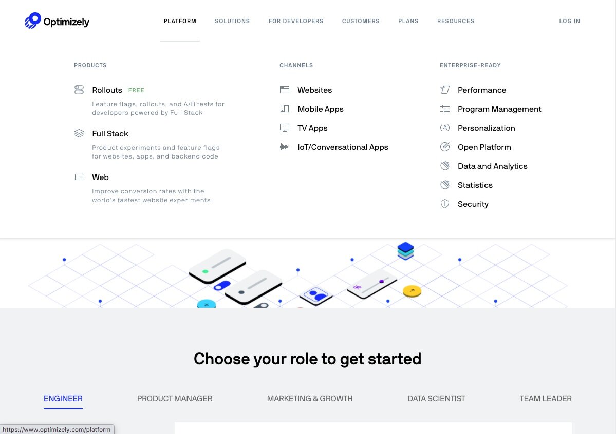
An all new website features a fresh homepage with modern chrome look and feel, and unique graphic shapes that help brand Optimizely in the language of data.

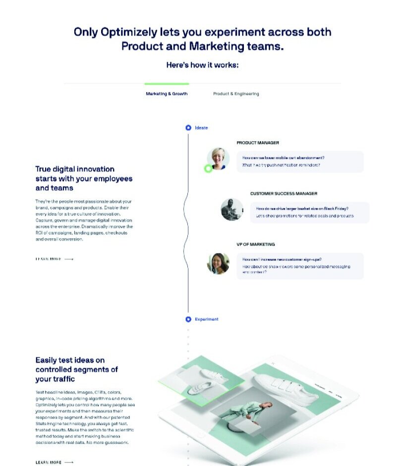
Scrolling down the homepage, you’re presented with a timeline showing how experimentation works and where it starts. The process begins with your employees, who offer up hunches and hypotheses about certain experiences and product features. Seriously, who knows better than them? Any new hypotheses are put to the test, where the winners are rolled out to the public and the losers are easily turned off. All decisions are made with data.

Further scrolling on the homepage reveals animated graphics showing the results of our experiment: metrics for increased conversion, sales, costs saved, etc. Owning data with a branded look and feel was an important part of the identity exploration.

An initial exploration for a retail solutions page hero. Experimentation is used extensively across a typical fashion site.

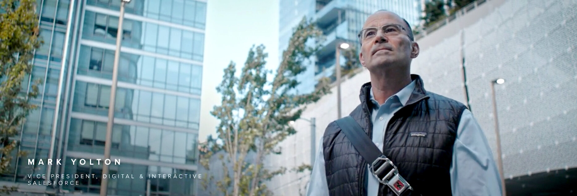
Mark Yolton of Salesforce describes how his team relies on Optimizely for experimentation across both product and web experiences. My role was to craft a narrative and work with a production team to secure the footage and edit to final cut.